Generating colors for syntax highlighting
There are many color palette choices for syntax highlighting, and I didn't want to have to pick one for my blog for light and dark mode. I suspect the formatting of this blog will change in the future, so I wanted a way to select a palette of colors with sufficient contrast automatically, in case I change the background colors for code blocks.
It seems reasonable to determine a minimum difference in lightness between the text and the background, and then find a set of unique colors within that range.
Contrast
The Web Content Accessibility Guidelines provide a description of contrast under its guideline of "Distinguishable."
Calculating a WCAG contrast ratio is easy:
To get the idea, there's an online interactive tool where you can try out colors to see how contrast ratios works. Contrast (Enhanced) recommends 7:1 contrast, and as low as 4.5:1 for large text.
Luminance is a measure of brightness, and WCAG provides a calculation of it from the sRGB colorspace.
I want to generate a unique set of colors which abide by WCAG contrast guidelines against a background for syntax highlighting. The goal is to provide starting background and foreground colors, some options, and then to generate a palette of colors to use.
Representing Colors
Selecting colors requires a slight detour into the field of colorimetry. Colors in computers normally get specified in RGB, in which colors are specified as a combination of Red, Green and Blue values.
While this is great and easy for computers to represent, the same amount of change in RGB values doesn't necessarily represent a perceptively different change in color. It's difficult to select a particular brightness or a particular hue.
HSL and HSV provide different axes along which to think about colors. These color spaces choose a color from the spectrum as a Hue, a tone of that color as Saturation, and then a lighter or darker shade based on Lightness (HSL) or Value (HSV). This feels like a more natural way to specify colors to me.
There are some fancier ways of describing colors, like CIELAB and CIELUV. The goal of these is to to try to represent perceptible changes in color uniformly within their spaces, but can be hard to use.
HSLuv provides a variation on CIELUV that aims to be like HSL in usability, but make saturation work as a percentage. This is great because it makes two distances of the same length in the color space closer to the same difference in how they're perceived.
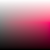
As an example with a fixed hue (red), saturation here goes up from 0 to 100% from left to right, and lightness goes from 0 at the bottom to 100 at the top. This makes the bottom left black, the top right white, and the middle left shades of gray. The middle upper part is pink, and the mid lower right is dark red.
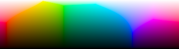
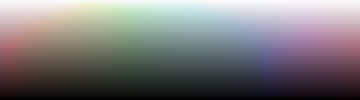
Increasing saturation makes colors more vivid, while lowering saturation causes them to look washed out. Starting with 100% saturation, and drawing hues from left to right, and lightness from bottom to top as before, you can see the fullness of the spectrum.
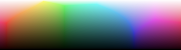
This looks more washed out as saturation decreases to 75%.
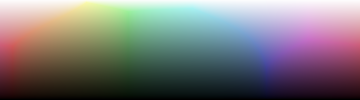
Even moreso at 50% saturation.
And very gray-like at 25%.
Method
HSLuv defines brightness of colors with similar luminance values to look approximately the same brightness. Using this property. the background color provides the starting ceiling or floor based on the desired minimum and maximum amount of contrast, and then color hues and saturation can be selected from that brightness level.
However, while the L in HSLuv is a measure of lightness, it doesn't exactly map directly to human perception of brightness. HSLuv can be mapped to CIE XYZ, where the Y does map to perceived brightness.
The math looks scary, but the implementation simply transforms the L of HSLuv to Y which maps to luminance in CIE XYZ, finds the desired contrast, and then transforms back.
I ported this from the hsluv repo.
There's minor differences between WCAG relative luminance and HSLuv, but there are claims of it to be negligible.
Once a palette with appropriate hues and saturation are selected, the lightness is filled it according to the appropriate contrast ratio I want. After selecting colors with various hue and saturation, the colors need to be converted back into RGB for use.
Testing the converted RGB palette colors with WCAG's contrast ratio function shows the converted values to be close to desired contrast to within 1 decimal point. This is good enough for my needs for now.
Result
The above code used this scheme as well!
The result works, but I'm not completely happy with it. The general approach of using HSLuv seems valid --- I've tried making a few different algorithms for hue and saturation selection and they all generate easy to read color palettes. What I have works well enough for me to take a break and do something else before revisiting this.